Contents:
1. About Web Buttons
Using Web-Buttons, You will be able to create any button You want! You can apply lighting effects, textures, bump-maps etc. Text, shape, size, shadows, material - every possible parameter is easily configurable.
System Requirements
Operating System: Microsoft Windows 95/98/Me, Windows NT4.0, Windows 2000, Windows XPCPU: Pentium processor minimum.
Memory: 32M or more
Recommended resolution: 1024x768
Free hard drive space: 3Mb
.
2. Quick start tutorial
2.3. Adjust lighting and material
2.4. Change text layout
2.5. Adjust bumps/texture
2.6. Add icon and shadows
2.7. Save button design/Make template
2.8. Export button image
2.1. Choose from templates
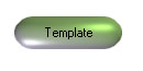
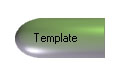
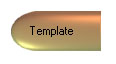
To create a new button design just pick a design from the Templates Panel or start from scratch, by pressing New on the Toolbar at the top of the window or New in the File Menu.
To pick a design from the Templates Panel just click the templates thumbnail.
2.2. Adjust shape and size
After picking the template of Your choice, let's adjust it's shape and size to meet our needs. You can adjust form settings from Default Panel or Shape Dialog box (Ctrl+F). Pick the shape you like and assign it's sizes and flatness
2.3. Adjust lighting and material
Next step is to adjust lighting and material. You can adjust lighting from the Lighting Dialog box (Ctrl+L). Material adjustment dialog box is available from the toolbar or by pressing Ctrl+M.
2.4. Change text layout
Next let's change the text. For this task You can use Text controls on Default Panel or Text Adjustment dialog box (Ctrl+T).
 |
2.5. Adjust bumps/texture
To make button look more interesting You can apply texture and/or bump-mapping. Texture/Bump Mapping adjustments are available from the Toolbar or from the Texture (Ctrl+X) or Bump Mapping (Ctrl+B) dialog boxes.
2.6. Add icon and shadows
2.7. Save button design/Make template
To save button design You can either press Ctrl+S or choose Save from the File menu. This vill save your design into .btn file so it can be used later. Another way to re-use your work is to create button template. You can do it by clicking Edit\Make Template in the main menu or by pressing Ctrl+E.
2.8. Export button image
To export resulting images into image files click File\Export menu item in the Main menu. You will have a choice to save either in Jpeg or Bmp or Gif or Png format. You can either set export options once in the Options Dialog box or adjust it each time you export.
3. User's manual
3.1. Lighting dialog box
3.2. Material dialog box
3.3. Shape dialog box
3.4. Texture dialog box
3.5. Bump Map dialog box
3.6. Text dialog box
3.7. Shadows dialog box
3.8. Icon dialog box
3.9. Default Panel
3.10. Options Dialog
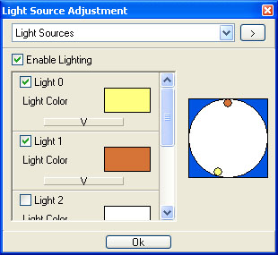
3.1. Lighting dialog box
In the Lighting dialog box You can adjust all lighting settings.
- Adjust Light sources position. Just drag the light source you want into new position.
- Adjust lighting color for each light source. Click the color rectangle and pick the color.
- Enable/disable lighting. Click Enable Lighting checkbox.
- Adjust advanced lighting settings: diffuse and specular colors. To do so click the "v" button on the bottom of the light source frame. Light source frame will switch to advanced mode. Then you can adjust specular and diffuse colors of the light source.
 |
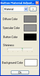
3.2. Material dialog box
In the Material dialog box You can adjust all material settings.
- Diffuse, Specular, Button colors. To do so just click on the corresponding color rectangles.
- Shininess. Drag the track bar to adjust the material ability to reflect light
- Background color. Click on the color rectangle and choose the color.
 |
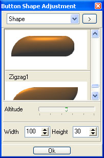
3.3. Shape dialog box
In the Shape dialog box you can:
- Pick the shape. Just choose the shape you like from the list and click it. It will be applied to you button.
- Change the size. Enter new value into the Width and Height fields or click the arrow buttons on ints' right side.
- Adjust altitude. Drag the altitude trackbar to change the altitude value.
 |
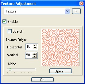
3.4. Texture dialog box
In the Texture dialog box you can:
- Open the texture file. To do so either click on the texture image or click Open button under it. The Open dialog box will appear.
- Enable/Disable texture mapping. Click the Enable checkbox to turn texture mapping on/off.
- Enable/Disable texture stretching. Click the Stretch checkbox to switch between the tile and the stretch modes.
- Adjust texture origins by entering new values or clicking on the arrow buttons to the right of the corresponding fields.
- Adjust alpha by dragging the Alpha trackbar. This will thange the blending proportion of image and texture colors.
 |
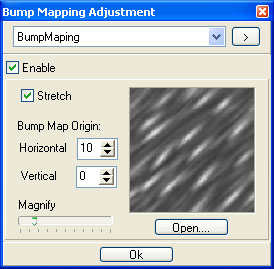
3.5. Bump mapping dialog box
In the Bump Mapping dialog box you can:
- Open the height map. To do so either click on the height map image or click Open button under it. The Open dialog box will appear.
- Enable/Disable bump mapping. Click the Enable checkbox to turn bump mapping on/off.
- Enable/Disable bump stretching. Click the Stretch checkbox to switch between the tile and the stretch modes.
- Adjust Height map origins by entering new values or clicking on the arrow buttons to the right of the corresponding fields.
- Adjust Magnify value by dragging the Magnify trackbar.This will adjust the height map's height multiplier value.
 |
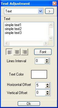
3.6. Text dialog box
In the Text dialog box you can:
- Change button text.
- Adjust lines interval by entering new value in the corresponding field or simply by clicking the arrow buttons to the right of it.
- Change lines' alignment
- Change text color. Click on the color rectangle and pick the color.
- Change text offsets.
 |
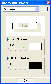
3.7. Shadows dialog box
In the Shadows dialog box you can:
- Turn on/off text and button shadows
- Adjust shadows' blur strenght
- Pick shadows' color
 |
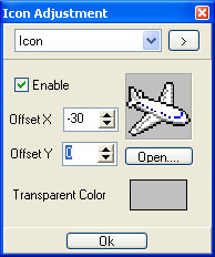
3.8. Icon dialog box
In the Icon dialog box you can:
- Choose the Icon file. Click the Icon image or Open button. You can load icon from Jpeg, Gif, Bmp, Png and Ico files.
- Turn the icon on/off
- Adjust icon's offset in the button
- Cnahge transparent color
 |
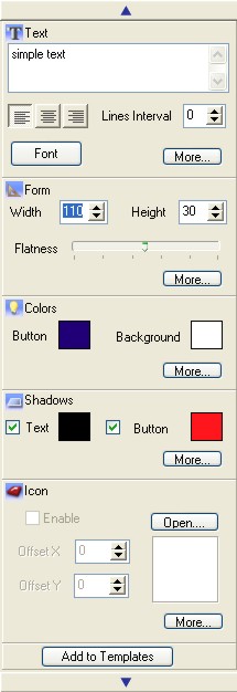
3.9. Default panel.
It contains basic adjustments from almost all dialogs to ease the task of fast template adjustment.
 |
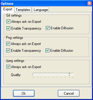
3.10. Options dialog.
In the Export tab you can set image export options.
- Always ask on Export. Use this option to either to adjust export setting just once (in the options dialog) or to adjust it each time you save images.
- Enable diffusion. This will turn the edge smoothing on/off.
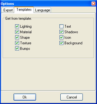
In the Templates tab you can choose, which settings will be applied to you button when you choose a template.
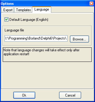
In the Language tab you can choose the .lng file that contains interface's language.
NOTE: Language changes will take effect only after application restart.
 |
 |
 |